
Ahead of the upcoming MLS season this weekend that will be sure to provide some great action and drama as Toronto FC aim to defend their title, we took a look at the ‘fits each club will be donning this year and gave ourselves the task to rank all of the kits in our league.
Every year, each MLS team gets one new jersey to sport, rotating between primary & secondary every other year, so we’re looking at the shirts that are premiering this season.
From LAFC’s first-year bust (advice in three words: seamless sponsorship incorporation) to Houston’s bold new style, look below to find our rankings for all 23 kits for the 2018 MLS season.
1. Houston Dynamo

The Dynamo did well this year. Houston from most of the league with a bold orange jersey, but its the design of their alternate that really set themselves apart this season. They went with a sleek road kit that pays homage to the infamous Astros’ jerseys throughout the 70s and 80s. The new kit will undoubtedly be a fan favorite.
2. D.C. United


D.C. kept it traditional with a black home kit this year, but it’s the flag-like chromatic loops across the whole chest area that make this shirt stand out. With the combination of sleek shorts and socks featuring stars and stripes, the club will be looking great at home. D.C. went with an unpopular white away kit that features a rib-like design on the chest and a 3-tone colorway throughout the kit.
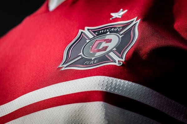
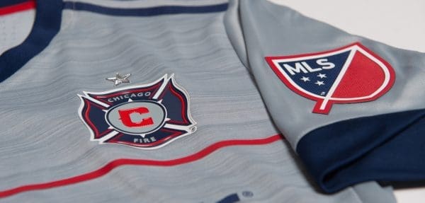
3. Chicago Fire


Honoring the 20th anniversary of the Fire’s impressive 1998 team, which won the double, the Chicago squad included a custom tag to showcase their MLS Cup and U.S Open Cup championships. The Fire decided to also pay homage to the historic inaugural squad with their unique double-white bars wrapping across the chest. The kit also features the infamous red stars that represent Chicago’s municipal flag.
4. San Jose Earthquakes


San Jose chose to go with more of an artistic path this year, with both their home/primary and away/alternate kits featuring designs that add a bit of flare and creativity. The new release for this season is their all-white road kit, dubbed the Navy SEAL Foundation jersey, which displays some cool designs that zig zag across the chest. Plus, it benefits the Navy SEAL Foundation, so it comes with a good cause and it allows the West coast to boast some patriotism and not just leave to the teams from the original colonies.
5. Philadelphia Union

It’s all about the hoops! Philly’s new home jersey sports dark blue hoops with alternating faded horizontal ones, plus gold numbers and gold trim. Despite the three color dynamic, it’s actually not very busy visually and it has a vintage soccer kit feel that will be a hit with anybody that can look beyond the team badge.
6. Colorado Rapids
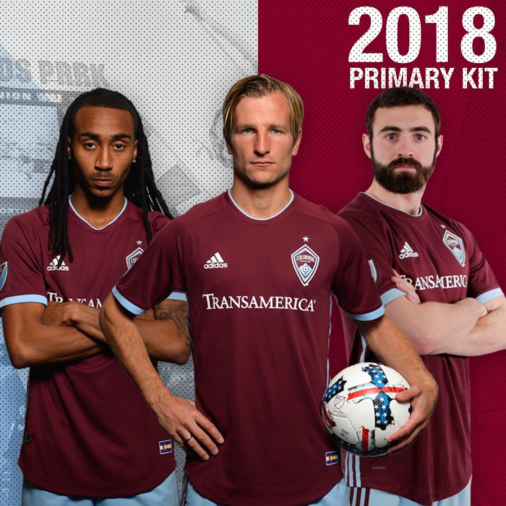
Colorado went with an updated look to their signature burgundy home kit that is as sleek as ever. The changes aren’t too drastic, but they are impactful, dropping the white sleeves to go instead with a bold full burgundy shirt that also brings back light blue accents.
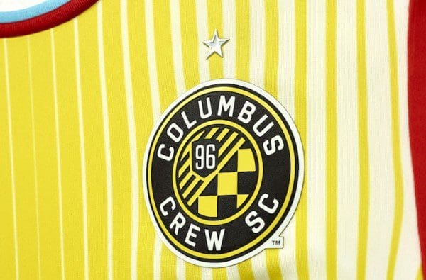
7. Columbus Crew


Columbus hasn’t veered away too much from the yellow home kit and the black road kit in the past years, but I think everyone’s okay with that. With this season possibly being their last amid rumors of the club folding or moving to another city, the club still found a way to showcase pride in their tradition and history. The alternate kit drops the yellow accents from its previous version, allowing for the all-black kit to look smooth with its checkered pattern embedded into the fabric and the gold accents via the logos + names & numbers.
8. FC Dallas


Dallas has gone with a home kit that is obviously inspired by the Texas state flag. It’s sleek and simple, and it actually looks pretty good thanks to this execution. Knowing state pride is the most prominent in Texas than in the rest of the country, and looking at that lone 5-pointed star on the sleeve, this will surely be a hit.
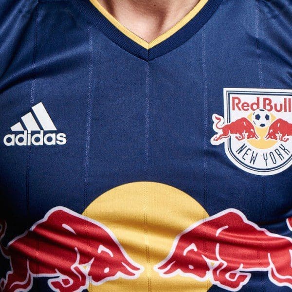
9. N.Y. Red Bulls


The Red Bulls made a good move this year veering away from their yellow-navy away kit. The new, revamped red-white-red kit features the signature Adidas three stripes that flow all the way from the armpit to the knee. The home kit also looks fantastic with a more abstract design of red lines that pierce through the front of the jersey.
10. Atlanta United
Atlanta chose to bring back their instantly infamous striped primary set that everyone loved from their debut season. They chose to go in a new direction with their away/alternate kit named “King Peach,” obviously inspired by the iconic Georgia peach. The kit looks pretty good with subtle hints of gray and a very attractive peach color highlighted throughout.
11. LA Galaxy
12. Minnesota United
13. New England Revolution
14. Toronto FC
15. Seattle Sounders
16. Orlando City
17. Portland Timbers
18. Sporting KC
19. Real Salt Lake
20. New York City FC
21. Vancouver Whitecaps
22. Montreal Impact
23. LAFC
Story by Jack Dombro – @jackdombro